
The Best ofIntima & Swim Edit
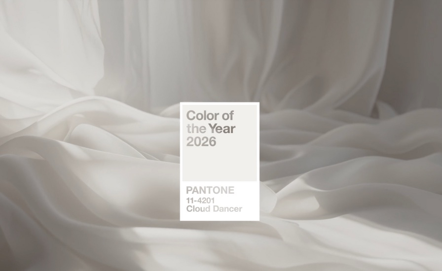
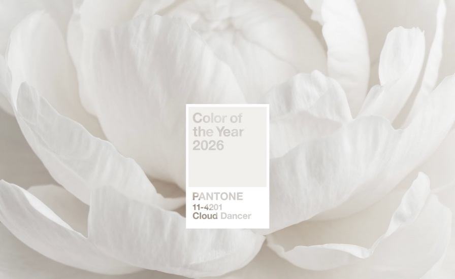
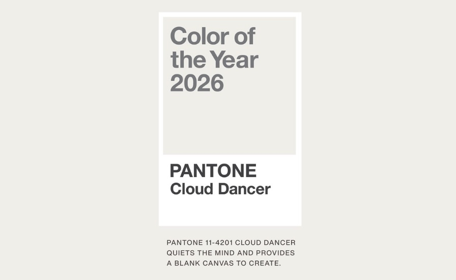
Pantone’s 2026 Color of the Year
Is this the quietest Color of the Year yet, and why does that feel so intentional?

Pantone's annual Color of the Year announcement usually arrives with a sense of drama. Bold hues, emotional undertones, a declaration of where culture is heading next. But for 2026, the shift is noticeably softer. This year's choice leans into restraint rather than spectacle, offering a shade that feels less like a statement and more like a pause.
Instead of pushing saturation or novelty, Pantone's latest selection centers on lightness, an airy, near-white tone that suggests calm, openness, and space to breathe. It's a move that feels reflective of the moment we're in, a cultural pivot away from excess and toward clarity.
Why This Color, Why Now
Color trends do not exist in a vacuum. They tend to mirror how people are feeling emotionally, socially, and even digitally. The past few years have been defined by intensity, hyper-colorful design, visual overload, and constant stimulation. Against that backdrop, Pantone's 2026 pick feels almost radical in its simplicity.
This is not about minimalism as an aesthetic flex. It is about neutrality as emotional grounding. The color functions like a blank page, inviting interpretation rather than demanding attention. It allows other tones, textures, and ideas to come forward instead of competing with them.
A Shift in How We Think About Impact
What is interesting about this year's choice is that its impact is not immediate. It unfolds slowly. In fashion, it points toward layering, tonal dressing, and pieces that rely on cut and fabric rather than color to make a statement.
In interiors, it signals warmth and softness rather than stark modernism. In branding and product design, it encourages restraint and longevity over trend-driven visuals.
The message is subtle but clear. Impact does not always come from being louder. Sometimes it comes from creating space.
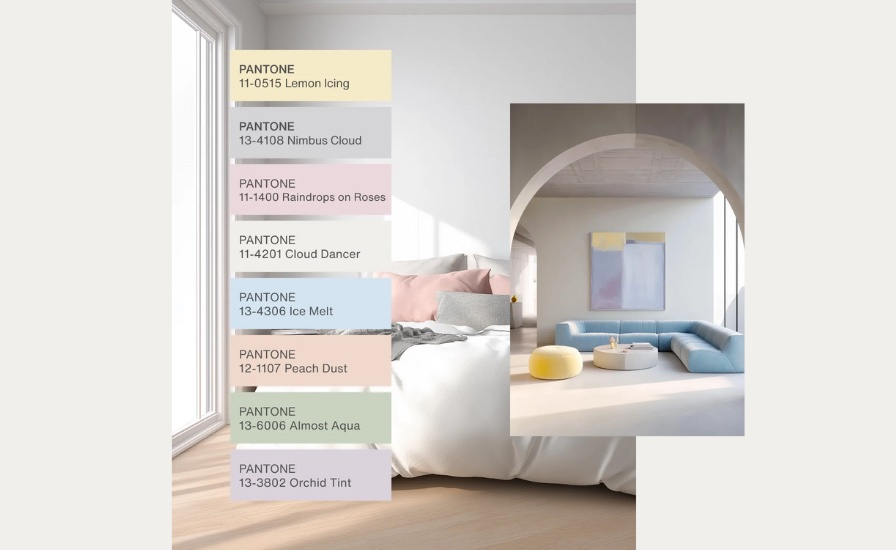
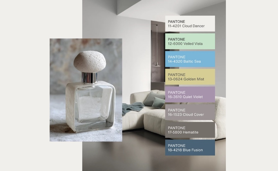
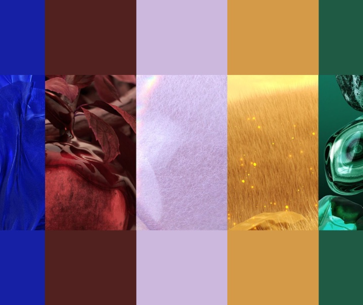
Color Palettes: Powdered Pastels and Light & Shadow
One of the most exciting ways to work with Pantone's 2026 color is through complementary palettes. Powdered pastels, soft blushes, pale lilacs, and minty greens bring gentle color into play while maintaining the sense of calm. These shades feel light, airy, and approachable, offering a modern twist on classic neutrals.
Equally compelling is the use of light and shadow to create depth around this near-white base. Soft gradients, reflective surfaces, and subtle textures transform the color from flat to dimensional. Shadows, warm highlights, and layered tones add richness, proving that even quiet colors can feel dynamic and visually engaging. This approach works beautifully in fashion, interiors, and product design, showing that restraint does not mean monotony.
Not a Trend Color, a Cultural Temperature Check
Pantone's 2026 color does not feel designed to dominate runways or social feeds overnight. Instead, it reads more like a cultural temperature check. It reflects collective fatigue and a desire for things that feel grounding, versatile, and emotionally neutral.
It is a color that adapts rather than insists. One that can feel clean, cozy, elevated, or understated depending on how it is used. In that way, it mirrors how many people are approaching style and design right now, more intuitively and less performatively.
The Takeaway
Pantone's newest Color of the Year is not trying to reinvent the wheel. It is doing something quieter. It acknowledges that after years of visual noise, subtlety feels refreshing. Whether this shade becomes ubiquitous or remains symbolic, its selection says something clear about the moment we are living in.
Sometimes, the most telling choice is not the boldest one. It is the one that invites us to slow down and look again.
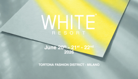
Disclaimer: This content is based on insights and forecasts published by Pantone. All images used in this blog are sourced from Pantone. Pantone provides authoritative color intelligence and a universal language of color, from trend forecasting and the Color of the Year to strategic palette guidance for brands, empowering designers and creators to make informed, consistent, and culturally resonant color decisions across industries.


Copyright 2026. All right reserved - Terms