
The Best ofIntima & Swim Edit
WGSN's Global Key Colors & Combinations for A/W 27/28
A Guide to Season-Defining Shades: Discover the five Key Colors that will impact all industries and regions in A/W 27/28.

WGSN's five key colors for A/W 27/28 are set to define the season's mood and make an impact across multiple industries. Along with design strategies and suggested color pairings, they are designed to resonate with consumers navigating uncertainty, polarization, and rapid technological change. The palette includes Luminous Blue, Russet, Peaceful Lilac, Maize, and Deep Green. Today, we will take an in-depth look at Russet and Peaceful Lilac. Stay tuned for a closer look at the other three.
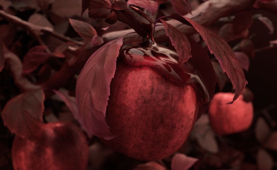
Russet
The trend forecaster suggests that Russet could stand out in A/W 27/28 as a color that feels inherently rich and natural. Its deep, earthy red-brown tone carries a sense of authenticity and understated elegance, drawing inspiration from the textures and colors of the natural world. Russet has the potential to add depth and sophistication to both fashion and interiors, while also providing a subtle, grounding presence in a season defined by change and unpredictability. Its broad appeal across cultures positions it as a shade that can unify and enhance diverse design applications.
Color Strategies & the Emotional Power of Russet
Russet is an essential red-brown tone that conjures up associations with abundance, love, strength and courage, and can be seen as a confident, versatile and assertive new neutral tone. Use this versatile color to meet consumers' desires for hues that provide more than just aesthetic appeal, offering qualities of reassurance, trust and stability. Use Russet to connect to the environment. Consider using natural dyes and pigments, and embrace natural color levels. Russet evokes trust, safety, groundedness, protection, rebalance, nourishment, captivation, confidence, fulfillment, and resourcefulness, wrapping warmth and strength into every moment.
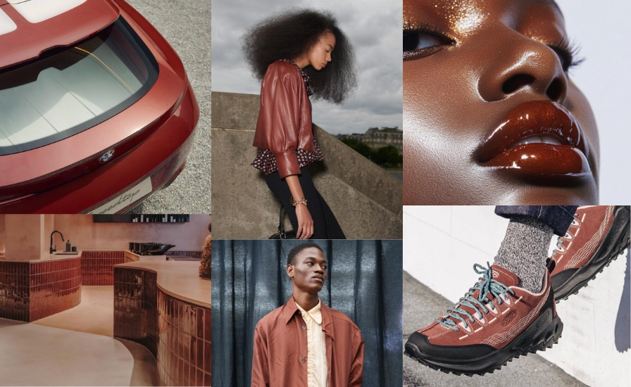
Color Evolution and In Action
Over recent seasons, Russet has emerged as the latest step in a subtle evolution of red-based browns. It follows in the lineage of shades like Astro Dust (A/W 23/24 and S/S 24), Intense Rust (A/W 23/24, S/S 25 and A/W 25/26), Amber Terrain (S/S 26), and Red Earth (A/W 26/27), each building on the warmth and richness of its predecessor. For A/W 27/28, Russet continues this progression, offering designers a hue that feels both familiar and contemporary. In action, Russet highlights the enduring appeal of red-brown tones, evoking nostalgia while adding depth and sophistication to fashion, interiors, and lifestyle applications. Its versatility allows it to act as a statement color or a grounding neutral, reinforcing the emotional and sensory impact of red-based browns in design.
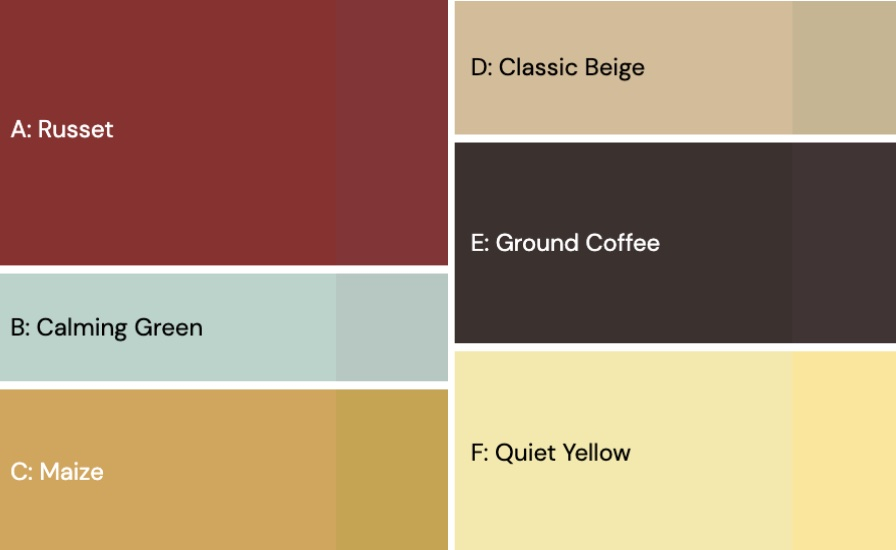
Harmonizing with Russet
Lean into Russet's grounded, trust warmthworthy to elevate cult classics with a retro-meets-contemporary edge.
Pair it with classic beige for a timeless, sophisticated base, refined pastels for a balanced pop, calming green for nature-inspired harmony, maize for sunny optimism, ground coffee for depth and understated luxury, and quiet yellow for soft, cheerful energy that captivates without overwhelming.
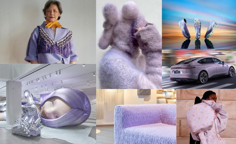
Peaceful Lilac
The trend forecaster suggests that Peaceful Lilac could emerge as a key shade for A/W 27/28, offering a sense of escape and imaginative play. This soft, yet vibrant hue blends both warm and cool undertones, creating a dreamlike, almost otherworldly effect. It draws on cultural references from music and counterculture, reflecting freedom, creativity, and self-expression. With its subtle energy and ethereal glow, Peaceful Lilac can transform a design, bringing a feeling of enchantment, curiosity, and quiet optimism. It's a color that encourages pause and reflection, making it particularly suited to fashion, interiors, and lifestyle spaces that want to evoke calm while sparking the imagination.

Color strategies & the emotional power of Peaceful Lilac
Peaceful Lilac brings a gentle sense of calm and softness to the A/W 27/28 palette, highlighting the appeal of delicate, restorative pastels. This shade can act as a counterbalance to the season's deeper mid-tones and darks, creating harmony and visual relief within designs. Its ethereal, otherworldly quality drawn from futuristic and AI-inspired concepts adds a dreamlike, imaginative dimension, making Peaceful Lilac a versatile choice for fashion, interiors, and lifestyle applications that aim to inspire creativity while offering comfort and serenity. Peaceful Lilac evokes serenity, restoration, inclusion, contentment, empathy, hope, mystery, enchantment, creativity, and empowerment, bringing a gentle, uplifting energy that inspires calm and imaginative exploration.
Color Evolution and In Action
Over recent seasons, the lilac family has gradually evolved into the ethereal tone now known as Peaceful Lilac. It follows Digital Lavender (S/S 23 and A/W 23/24), Gentle Lavender (S/S 24 and A/W 24/25), Galactic Lilac (S/S 25 and A/W 25/26), and Light Lavender (A/W 26/27), each building on the softness and dreamy qualities of its predecessors. For A/W 27/28, Peaceful Lilac brings a gentle, restorative presence to the palette. In action, it adds a touch of calm and serenity to fashion, interiors, and lifestyle designs, offering a soft, whimsical contrast to the deeper tones of the season.
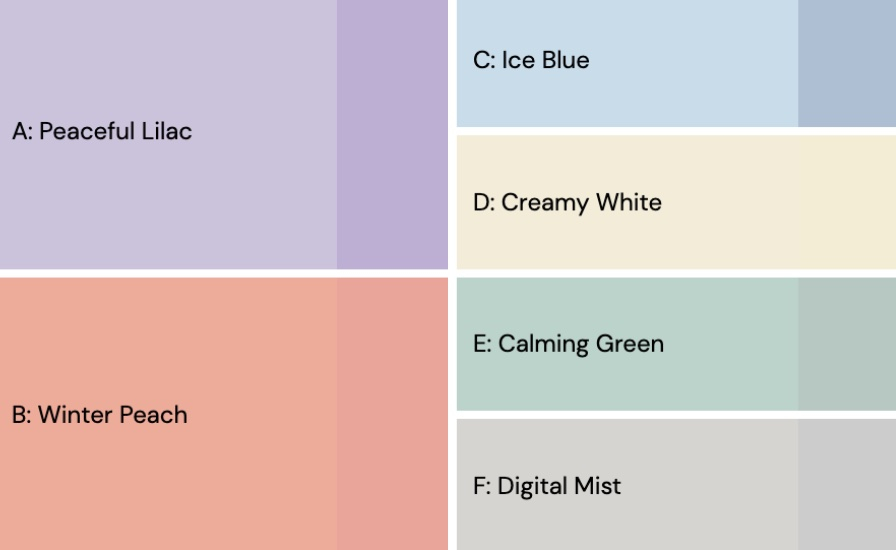
Harmonizing with Peaceful Lilac
Peaceful Lilac takes center stage in creating a dreamy, otherworldly palette for A/W 27/28, offering a soft, restorative presence that can elevate fashion, interiors, and lifestyle designs. Pairing it thoughtfully with other shades allows its ethereal qualities to shine while building harmony and depth. Winter Peach introduces a gentle warmth that balances Lilac’s coolness and creates an inviting, comforting contrast. Ice Blue adds a crisp, refreshing edge, highlighting Lilac’s airy and serene nature. Creamy White provides a neutral canvas, letting Peaceful Lilac stand out while adding lightness and sophistication. Calming Green brings a grounding, natural element that reinforces Lilac’s restorative energy. Finally, Digital Mist amplifies its futuristic, AI-inspired dimension, adding subtle mystery and intrigue to the palette. Together, these pairings create a balanced, imaginative, and versatile color story for the season.
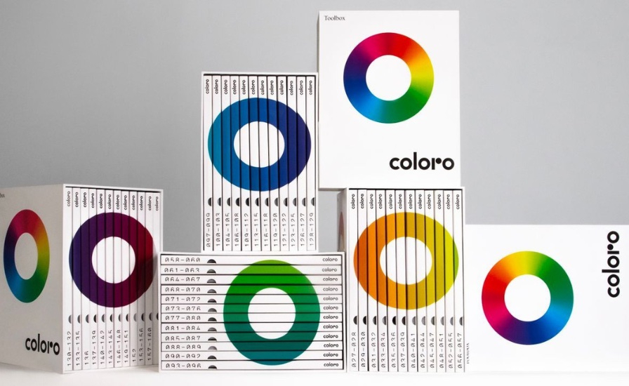
Those: Precision and Possibility in Color
WGSN's chosen color partner, Coloro, is widely recognized for its expertise in color excellence, trusted by leading global brands to deliver inspiring and precise color solutions. Its suite of physical and digital tools is designed to streamline the design process from concept to product delivery, helping teams save time and reduce waste throughout the production cycle. By providing accurate color insights at every stage, Coloro allows designers to confidently translate their creative vision into tangible results.
One of Coloro's standout innovations is the Coloro Feasibility Intelligence (CFI) tool, a first-of-its-kind data solution that assesses the feasibility of colors across different fabrics and light sources before production. Using a simple traffic light system, CFI highlights potential challenges and guides designers toward alternatives that maintain the original creative intent. For example, Luminous Blue shows low feasibility on cotton, meaning the target shade may not be reliably achieved. In such cases, CFI can recommend a close, fabric-feasible option without compromising design integrity. These insights give design and color teams the confidence to make informed decisions and unlock new possibilities for their collections. Book time with the Coloro team to explore the full capabilities of CFI and bring your color vision to life.
Coming Soon
Stay tuned for a more in-depth analysis of Luminous Blue, Maize, and Deep Green in the future.
Disclaimer: This content is based on insights and forecasts published by WGSN. All images used in this blog are sourced from WGSN. WGSN provides in-depth trend analysis across consumer, lifestyle, and product design, offering strategic guidance one, two, five, and ten years in advance to help brands stay ahead of the curve and respond effectively to change.


Related articles:


Copyright 2026. All right reserved - Terms